| DrumBeat: November 19, 2007 | The Oil Drum | Estimating the World Production Decline Rates from the Megaproject Forecasts |
Is the Decline of Base Production Accelerating?
Posted by Stuart Staniford on November 19, 2007 - 10:45am
Average percentage change annually in global base production (prior to new capacity enumerated in Skrebowski megaproject lists). See text for details. Graph is not zero-scaled. Click to enlarge.
Note: In the course of preparing this piece, there was a lot of back-and-forth on the Oil Drum editors-and-contributors list, and Khebab and I realized we were working on related analyses with broadly similar conclusions, and agreed to publish them on the same day. I encourage you to read his piece also.
I began this post because JD of Peak Oil Debunked has recently reemerged from voluntary retirement (possibly as a result of near $100 oil) and was tweaking me about an old piece of mine from two years ago. That analysis looked at several pieces of evidence for a "decline rate" at 8% (probably not all the same kind of decline rate) and pointed out the scenario of adding known new capacity to an 8% decline rate in existing production would be a bad thing. JD notes that production since then hasn't declined as fast as that scenario suggested. I think he's making the piece out to have taken a much more certain position than it really took (it was a scenario, not a forecast, and I plotted several others). Nonetheless, the tone of the piece now reads to me as too gleefully "Isn't this scary?" That is a fault I resolve to try and avoid in future.
I pretty much decided that whole style of bottom-up megaproject analysis was not very useful around that time after this look at Saudi megaprojects and production. But, we know far more than we did in November 2005 and it seems to me that there are now interesting insights to be had from looking at the megaprojects and the various decline rates they imply.
In particular, one of the biggest things we know now that we didn't know then is that global oil production has been close to flat during that time, as prices have continued to go up and up. The latest publicly available data looks like this:
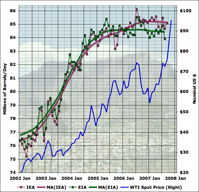
Average daily total liquid production, by month, from EIA (green) and IEA (plum), together with 13 month centered moving averages of each line, recursed once (LHS). WTI spot price (blue - RHS). Click to enlarge. Graphs are not zero-scaled. Source: IEA Oil Market Reports, and EIA International Petroleum Monthly Table 1.4. The IEA line is taken from Table 3 of the tables section at the back of the OMR in the last issue for which the number for that month is given. WTI spot price is from the EIA with November estimated from average of daily figures available so far.
One of the central factors in the future of oil production is the ability of the oil industry to bring on new capacity. Economists generally believe that industry will respond to a period of high prices by bringing more supply to market, albeit with some lag since oil industry projects are large complex undertakings that take a number of years from inception to actual oil flowing into tankers. A number of people attempt to enumerate such projects, and the best known of the enumerations that's actually publicly available is a series by Chris Skrebowski, a long time oil market analyst and editor of Petroleum Review.
The reports each consist of a list of the projects with name, the year of first oil production, and the peak flow of liquid fuel expected from that project. The reports in some cases have a tabulation of the new capacity, and conclude with some commentary on the implications for future oil supply. What's very interesting is that we now have four versions of Skrebowski's megaproject report, which gives us a much better ability to analyze trends. The four I can find publicly available on the Internet are these:
- Jan 2004 report (100kbd cutoff)
- Oct 2005 report (75kbd cutoff)
- April 2006 report (50kbd cutoff)
- Feb 2007 report (40kbd cutoff)
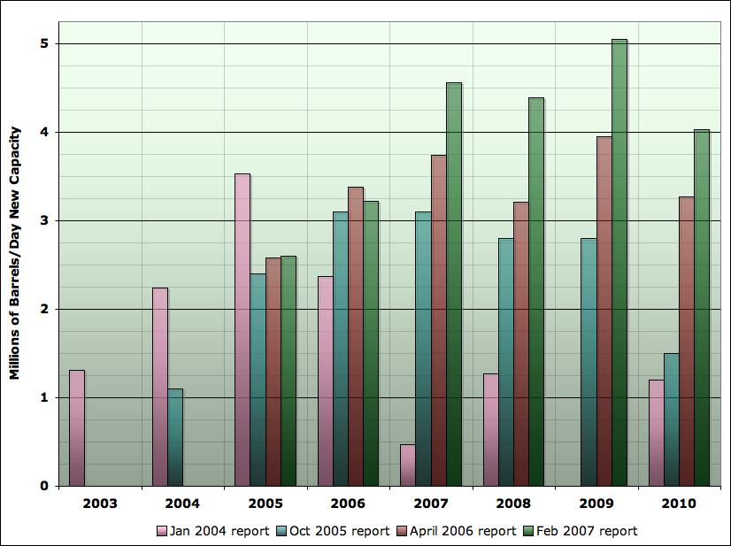
New oil liquids capacity 2003-2010 as estimated from four different Skrebowski megaprojects reports: Jan 2004, Oct 2005, April 2006, and Feb 2007. Data are from tabulations in reports, except from Jan 2004 report where projects were summed by this author. Hat tip to Euan Mearns for the idea of plotting this data this way.
However, it also seems likely that high prices are causing additional capacity to materialize. The other notable trend in the graph above is that it's rising strongly - starting out at just over 1mbd of new megaprojects coming on stream in 2003, we rise to over 5mbd of new projects currently anticipated in 2009. The overall trend is that new capacity per year is itself increasing at a little less than 1mbd each year. It's hard to believe that this isn't a response to the high prices of the last few years.
I want to stress an important caveat before we move on. The megaproject reports give the estimated peak flow from a project, but place it in the year in which it first delivers any oil. It's very likely that the production does not reach the peak value on day one, but instead ramps up over a period of months or even years. For an example, look at the front side of the curve on this originally planned production curve for the White Rose field in Canada:

Originally planned production profile for White Rose oil field, Canada. Source: Offshore Technology Magazine
I would like to deal with another potential caveat, here, which is the changing size of the limit in the different megaproject reports. Is this an important contaminating effect? To analyze this, I looked at the amount of capacity in the 2007 report, which with a 40kbd limit is the most comprehensive. I looked at the projects only through 2010 (to limit the degree to which far off years might miss more small projects than big ones), and analyzed the fraction of capacity that would have been missed with the 2006 limit (50kbd), the 2005 project limit (75kbd), and the 2004 project limit (100kbd).
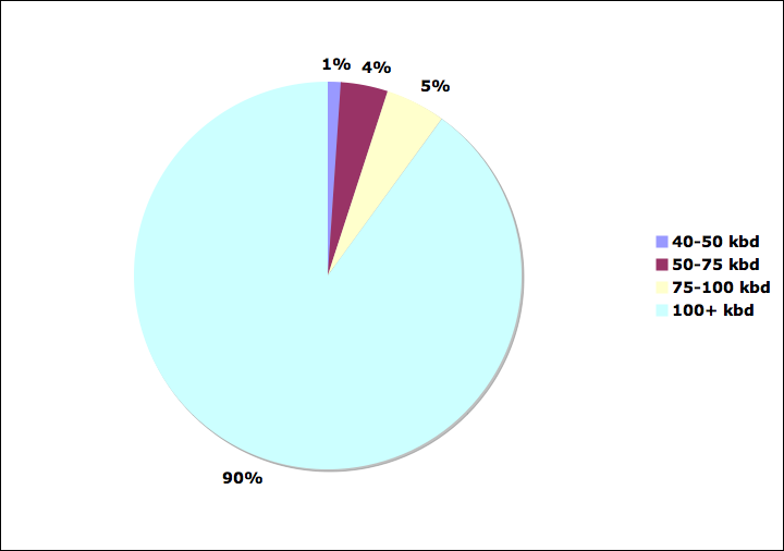
Analysis of capacity in the Feb 2007 megaprojects report by size grade (projects through 2010 only). 40-49kbd projects would only be included in 2007. Projects above 50kbd would be included in the 2006 report also. Projects above 75kbd would have been included in the 2005 report. Projects of 100kbd and up would have met the criteria for all reports.
Indeed, more generally, small fields are probably not a massive contribution to capacity. I plotted the same list of fields in a histogram of the amount of capacity being added by each size grade of projects (in 50kbd wide bins), and then computed the cumulative density function from that. Both are shown here:
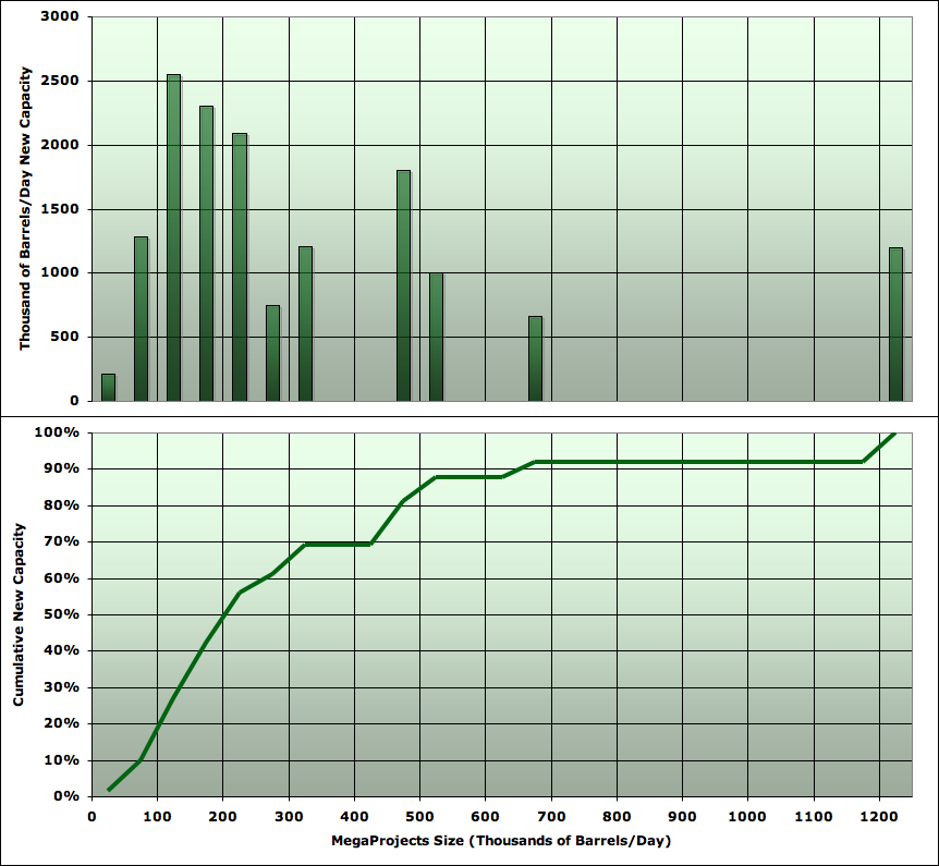
Analysis of capacity in the Feb 2007 megaprojects report by size grade (projects through 2010 only). Top panel shows histogram of capacity by project size in 50 kbd bins. Lower panel shows cumulative density function of capacity by project size. Note the last bin on the left will be underestimated since report only includes projects over 40kbd.
Before we dive into further detail, let me summarize the two qualitative facts that drive the analysis presented here. I claim:
- Global oil production has been recently flat.
- New oil capacity brought on stream each year is rising rapidly.
Let's now drill into those facts in more quantitative detail, and you can see whether you are persuaded or not.
I first want to look much more carefully at the flattening of global production. This implies that the rate of change of production over time has been getting lower. To assess this, I looked at four different data series. The reason for this is that different agencies and organizations disagree on the amount of oil produced each month. Additionally, it's possible to focus on narrower or broader definitions of oil (whether or not to include very light liquids known as condensate, compounds that condense out of natural gas (called NGLs), production from tar sands, biofuels etc). I generally prefer only to draw conclusions which are not too sensitive to exactly which definition or series we look at. An effect seen only in one series is probably not very robust. Similarly, I don't like to be too dependent on the values in any particular month (since month-to-month production jumps around noisily), so I like to use some kind of average or trend-fitting as well.
The four global production series used in this analysis are shown as follows from Jan 2004 to the most recent month available publicly:
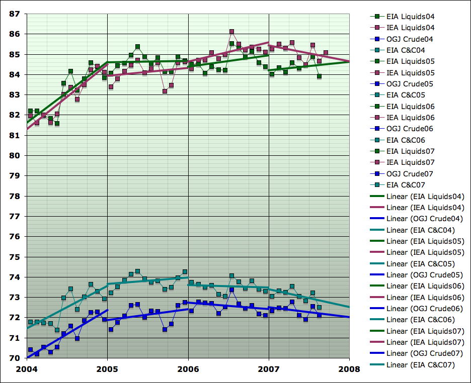
Average daily total liquid production, by month, from EIA Table 1.4 liquids (green), IEA Table 3 all liquids (plum), EIA Table 1.1 Crude plus Condensate (teal), and Oil and Gas Journal crude oil (blue), together with separate linear fits within each year for each series. Click to enlarge. Graph is not zero-scaled. Source: IEA Oil Market Reports, EIA International Petroleum Monthly Table 1.1 and 1.4, and Oil and Gas Journal. The IEA line is taken from Table 3 of the tables section at the back of the OMR in the last issue for which the number for that month is given.
From that graph, I computed the next one, which shows an estimate for the rate of change of each production series over time. I constructed estimates in two ways. At year boundaries, I took the year on year change. At mid-years, I used the slope of the straight line fit in that year.
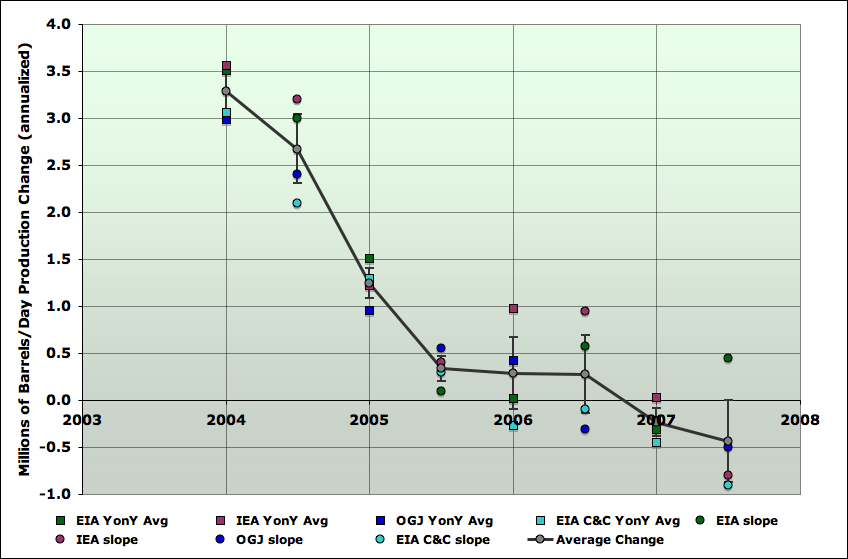
Annualized change in production for four oil data series referenced previously. The values at year boundaries are computed by differencing the forward year from the backward year. The values at year middle are computed from the slopes of the regression lines. Error bars are estimated from the spreads of the values for the difference series, and are rough. Graph is not zero-scaled. Click to enlarge.
I will use small font for somewhat more technical points that some readers may prefer to skip. The error bars are computed as the standard error derived from the four data points shown at each year and half-year. These are not really statistical estimates, since the four data series are not random picks from some population, but rather different ways of defining oil and estimating the amount of it produced. Nonetheless, if one thinks of these as more or less random picks from the abstract ensemble of reasonable procedures for analyzing this problem, I think the error bars are still meaningful for making rough estimates of the amount of uncertainty that can be imputed to our trends, and thus whether or not I have proven my conclusions adequately.
So with that, we can now compare the decelerating production with the accelerating new capacity on one chart. This next shows the same production change as in the last chart, except I dropped the estimates from the original series, keeping just the average and the error bar. Additionally, I introduced the amount of new megaproject capacity that is tabulated for each year.
Megaproject capacity for each year is taken from the latest report that has a figure for that year. Capacity is credited at the end of the year it came on stream - thus the data point at 2004.0 is the 2003 megaproject capacity (taken from the 2004 report). Error bars are computed by taking the spread of the different reports in each year, and then using an RMS average to pool all years into a standard error bar. As before, this should be taken as a useful rough indication of the general level of uncertainty in the problem, but not a precise statistical statement. It may seem that this overstates the error bar, since earlier reports presumably have much less accurate tabulations than later ones. However, given the potential issues with slow ramp up of flows, I prefer to leave them as large as they are. It is possible that the entire megaproject capacity curve would really be shifted somewhat to the left or right if we fully understood the ramp-up profiles. However, it seems hard to believe that the basic shape of it being a rapid rise would be erased.
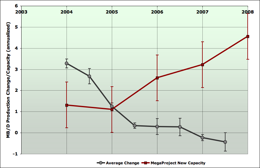
Average annualized change in production for four oil data series as explained from previous graph, but with individual series omitted (grey). Red curve is new megaproject capacity listed for the prior year. Error bar is estimated from the average spread of megaproject estimates between the four reports. Graph is not zero-scaled. Click to enlarge.
Firstly, if we were to watch production for a median oil well somewhere in a median oil field, and didn't do anything to it except fix mechanical breakdowns in the operation, chances are that its production would be somewhat less over time. This would take many different forms - perhaps water would break through some strata in the rock into the well, perhaps pressure in the field would drop, perhaps the rock pores close to the well would become more clogged.
In an individual well, these various decline processes would be quite random and non-uniform. However, if we imagine the thought experiment of doing this with all the oil wells in the world, or in some particular region of interest, presumably there would be some statistical averaging, and we could get an average rate of decline for the wells. Some wells would be in good rock with a thick oil layer, and would barely decline at all. Others might have a massive water breakthrough and experience almost 100% decline. But on average, there would be a certain percentage decline rate. We might expect this to increase over time, as more of the world's production assets are in a more mature state and more prone to problems of all types, but I'm not aware of any work quantifying this increase.
Let's call this quantity the petrophysical decline rate: the average rate at which well production would decline on an annual percentage basis if no corrective action were taken.
Now, in reality, the world's oilfield operators are busy taking corrective actions of all kinds. Wells are worked over or stimulated, water is shut-off down hole in various ways, new wells are drilled between the old ones, new zones are perforated that had previously been ignored, etc, etc. So when we take a fixed collection of fields that have been developed at some date, the average change in their production will be different than the petrophysical decline rate.
Additionally, a variety of things affect production that are not directly related to oilfield operations, but affect them. Weather causes shutdowns of facilities, as do fires, accidents, earthquakes, revolutions, societal collapses, wars, and the operation of economics. In particular, the latter means that sometimes operators may deliberately shut in productive capacity and then sometimes they may turn on that capacity again. Furthermore, the diligence with which they go about fixing up their oilfields and trying to offset petrophysical declines will be influenced by oil prices, and perceptions thereof.
Thus when we take a fixed set of oil fields and look at the change in it over time, there are a large number of factors that go into it, which we cannot easily separate out. The petrophysical decline rate is only one of them - though certainly an important one. So let's call give this quantity a name too:
The base production growth/decline rate is the annualized percentage change in the production of some set of currently operating oilfields of interest due to all causes.
There is one more rate of change which interests us. After the base production has done whatever it has done, the world (or some region) adds on new capacity in new fields, or previously undeveloped areas of existing fields large enough to be identifiable as separate new capacity projects. It is this activity that the megaproject lists attempt to capture. After the new capacity has been added onto the underlying base production of existing fields, we find out whether this was enough to grow production, or if in fact production declined. So we define:
The net growth/decline rate is the annualized percentage change in the production of oil from all sources in the world, or some region of interest.
This last decline rate is the one society really cares about. In my view it's the central thing that controls how easily society can adapt to the peaking of global oil supply, and it is the one that Hubbert linearization says should worsen only very slowly.
However, the base production growth/decline rate is also of considerable interest, because it's directly related to the net growth/decline rate via the new capacity. So the worse the base production fares, the more new capacity is required to make up the difference. The petrophysical decline rate would be of great interest too, but, as far as I know, we have no public data with which to assess it. However, we can infer the base decline rate because we have public estimates of new capacity and also of production changes.
So let's do that. Taking the estimates I showed in the last graph for production change and new capacity one can compute the base production growth/decline rate over time via
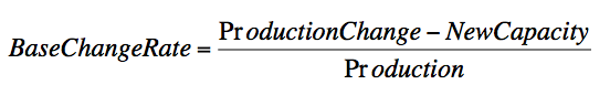
and here it is:
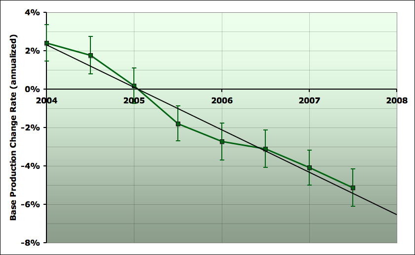
Average percentage change annually in global base production (prior to new capacity enumerated in megaproject lists). See text for details. Graph is not zero-scaled. Click to enlarge.
So, this graph summarizes quantitatively what I've been talking about above. Flat production in the face of increasing new capacity means that the base production must be doing worse and worse. And indeed we see that base production has gone from increasing at over 2% per year at the beginning of 2004, to now decreasing at about 5% per year. And the trend has been close to linear over these (almost) four years - the base production growth/decline rate gets worse at about 2% (percentage points) per year.
Now, I should emphasize here that it is not at all clear, at least to me, why this is happening. Given the way I've defined my terms, I'm very confident that it is happening (notice the trend is much larger than the error bars). But what it means is less certain. In particular, why this should be anything like a straight line is quite unclear.
I think most of this discussion will have to happen another time, but it's worth making one point now. The increases in base production in 2004 were due in large measure to the deployment of previously spare Saudi capacity, and also the Russian revival, (which has largely not shown up as projects on the megaproject lists). These increases were large enough to overcome petrophysical declines and even increase base production. However, Saudi Arabia subsequently began to decline, and then has been roughly flat this year. Russia has continued to increase, but more and more slowly. So these things cannot explain most of the more recent acceleration in base decline.
Here are some other candidate hypotheses we might consider:
- The petrophysical decline rate is worsening as some significant fraction of the world's production base is getting more mature and running into serious problems.
- The increase in megaprojects, and general cost inflation, is putting enough strain on industry capacity that routine maintenance operations are harder, and so it is more difficult to do the necessary work to offset petrophysical declines.
- War/revolution/accident/weather/etc factors have been worsening significantly during these four years.
- Some parties are keeping increasingly large amounts of production off the market deliberately (and secretly).
To explore the space of possibilities, this final graph presents four scenarios for total liquids production through the end of 2009.

Average daily total liquid production, by month, from EIA Table 1.4 liquids (green), with moving average through August 2007. Also, three scenarios (not forecasts) illustrating (red) case of continued acceleration in base production declines with megaprojects as in 2007 report, (orange) an extra 1mbd of projects in 2008 and 2mbd of projects in 2009 over and above report, and (green) extra projects as in orange scenario, plus base change rate stops accelerating and stays at current -5.5% value.
The orange curve assumes that a) the acceleration continues as with the red curve, but, noting that the megaproject lists have been tending to grow with time lately, also assumes b) that 2008 new capacity is 1mbd more than the megaproject list, and that 2009 is 2mbd more. That leads to a net decline of closer to 1% per year.
The blue curve assumes that a) the acceleration stops, and base decline remains at the current 5.5% per year, b) new capacity comes on exactly as the 2007 megaproject report shows. That leads to a net decline of a little less than 1/2%/ year.
Finally, the green curve makes the same assumptions about boosted new capacity as the orange curve, but like the blue curve supposes that the accelerating base decline stops, and decline stays at a fixed 5.5% rate. As you can see, that is enough to cause net production to grow, and postpone peak oil for some time longer.
Overall, while there remains a lot of uncertainty, seeing this acceleration of base declines makes me lean a little further in the direction that the Russian situation of slowing production increases in the face of greatly increased rig counts also hinted at. Specifically, it suggests that perhaps by sometime in 2008 we will have unambiguous declines in total liquids production, rather than continued plateau. I'm not certain at this point, but that's the direction I lean.
Contact
- Content: editors at theoildrum dot com
- Tech support: support at theoildrum dot com
License

This work is licensed under a Creative Commons Attribution-Share Alike 3.0 United States License.
http://science.reddit.com/info/60xsr/comments/
thanks for your support.
Regarding JD's reappearance, what was truly bizarre about his comment is that there is almost no chance that Saudi Arabia will not show an accelerating crude oil production decline rate from 2006 to 2007, versus 2005 to 2006 (average annual production data). We can argue "why" Saudi production is down, but an accelerating annual production decline rate, at least from 2006 to 2007, is a near certainty, and I estimate that this will result in close to a 10% decline rate in net liquids exports.
Regarding the base supply, like a lot of people, I think that we tend to find the big fields first. Peak Oil is really the rise and fall of the big fields. We can make money finding smaller fields post-peak, but it doesn't look like we can make a real difference, e.g., Texas & the North Sea--virtually no restrictions on drilling, best available technology, developed by private companies, resulting in declining production.
And Stuart's posting is the highest compliment JD could get from all his efforts. It really doesn't matter what kind of claims he makes (made for so long back then), just like the yellow press - main thing is that it gets attention!!
Cheers, Dom
I was struck in this analysis by how little the small fields seem likely to contribute. After I finished the piece, I thought of the following way of looking at the data. I sorted all the 2007 report projects (through year 2010 again - about 15mbd of total capacity), and computed the cumulative capacity if you cutoff on the low side below each project. So essentially it was as though I tried the cutoff at every project size. That gave me this graph:
As you can see, the extrapolation suggests there's only another 2mbd of capacity - about 15% more - in the fields below 40kbd. Unless it turns out that fields less than 40kbd have some completely different behavior than those above 40kbd.
Of course, in the analysis in the piece itself, new small fields are effectively one of the things going into the base production decline/growth rate.
Yes, they tend towards not being economically viable, particularly those in x thousand feet of storm tossed ocean.
Therefore you should expect that 2Mbpd to be an optimistic estimate.
If I fit only to the data below the big step at 100kbd, I only get another 1mbd of small field capacity:
(Clearly, people like to design projects to produce a nice round-number nameplate capacity).
It's an interesting approach, it reminds me a little bit of the parabolic fractal law. Have you tried to order projects in log(size) versus log(rank)?
Yep. My eye based regression ended up at about 15.5Mbpd or 500kbpd extra. However all those 100 and 200 kbpd items scream marketing numbers rather than engineering.
All of which is unlikely to change the price of fish overall. Even if someone did find a >1mbpd field tomorrow; its still going to be post peak before it came onstream, subject to the same post peak political pressures. Frankly, now, its mass efficiency gains and culture adaptation that has the biggest part to play.
Stuart,
the reason that the small fields seem to contribute less is overhead. Small fields in shallow water can be drilled and recompleted with a jack-up drilling rig. When the water is over 500 ft, it requires a drill ship and a floating production platform which is much more expensive. I'm not sure about the break for the water depth, it may be shallower but I do know the drill ships are a lot more expensive.
That's the reason that the horizontal wells have such a quick collapse, too. Because they are in areas like the North Sea which require much heavier engineering than a tropical sea, the operators can't operate low volume wells. Onshore in places like the Giddings field, a horizontal well can make money with a 5 barrel a day well but in an offshore field a fifty barrel day well may be uneconomic. Its BS to say it makes them colapse quicker for a horizontal, the real reason is the overhead. Multinationals also have a lot higher company overhead than Devon or Apache in shallow water, or Anadarko in the Austin Chalk.
Bob Ebersole
But the overall contribution of these low flow rates are small so who cares about the economics of 5 vs 50 barrel a day wells. What I think your missing is once you drill a horizontal well the opportunities for rework are small. They are very efficient and basically give a square production profile. The key is that production profiles from horizontal drilling are quit different from traditional approaches and at the end of the day decline is much steeper. Correct me if I'm wrong but my understanding is that if you produce using horizontals once production collapses you move on with no attempts to work over.
Also another point is that technology does not makes production from deeper offshore regions equivalent to shallow or on shore wells. Its a apples to oranges comparison yet over time more and more of our production has come for deeper and deeper offshore regions.
The net effect is that the amount of oil that can be produced at high production rates has dropped far faster then the production rate and thus we have extracted our easy oil a lot faster over time. The easy high flow rate oil is gone. One reason I don't like URR the bulk of the oil that extractable on the back side would be extracted at a lot lower flow rates compared to the front and the economics esp offshore points towards little of this oil as actually being recovered.
We are facing the collapse of two major sources for oil. Offshore and the giant fields. One because horizontal drilling and conditions makes workovers or low production uneconomic and the second because we have already worked over the giant fields extensively. The total amount of oil remaining may not drop that much over the next few years but it makes sense that production rates will decline fairly steeply.
Good points, memmel, Ill think about them. Horizontal workovers are a lot harder and more expensive, because its hard to get downhole equipment out when its anything other than verticle. They are a lot more likely to get stuck. Also washing sand out can be a very tough problem. I've never done either, thats coffee shop gossip. And when you add in my point about overhead being a lot higher it all is pretty muddled . Bob Ebersole
I think the collapse of the onshore Yibal field in Oman following horizontal drilling and massive investment by Shell is more consistent with Memmel's argument. Thoughts?
To some extent but I'm asserting that the situation has gotten to the point that whole regions would show production profiles similar to Yibal.
A simple example consider the case that you have one well drilled with old technology and it produces at a constant rate for 30 years and one drilled 15 years later with new technology and it produces at a constant rate for 15 years when you hit the 30 year mark both wells need to be replaced.
Now assume that you manage this and replace with two wells that last only 5 years in five years all production has to be replaced. Real live of course causes this to be staggered but you see that even though you where digging your self into deep trouble production rates remained constant. In effect the treadmill of depletion has been speed up by technology and now we have reached the point that 5 year well lifetimes are not uncommon. This means overall production will effectively collapse since you cannot sustain production rates for any length of time under these conditions.
In any case lets just watch the GOM production if I'm right then we should soon see people talking about unprecedented and unpredicted decline rates. They just are not reading the right blog.
Jeff - since you actually work in small oilfield operations, do you see any trend on the ground in the ability/desire to execute on small projects? Eg, one hypothesis for part of this decline acceleration could be that it's gotten harder for small projects to get rigs and other needed capital equipment, so the small project/large project capacity ratio is worsening. Do you see any evidence of that?
Yes & No.
We are on the bottom of the food chain, looking for small (but potentially very profitable) shallow oil fields in the 1,000' to 5,000' range. Our shallowest current production is about 1,300'. Our deepest about 4,200'. So, the small rigs that we use are really of much use for deeper stuff. And while we are seeing across the board increases in costs, the costs for deeper wells are increasing at a vastly higher rate than for shallow wells.
Having said all of that, access to drilling rigs is still a problem, and my principal joint venture partner has gotten around the problem of a lack of equipment by buying two small drilling rigs and a workover rig.
I sent a memo out to my joint venture partners telling them that, IMO, the neverending energy crisis/boom (two side of the same coin) really kicked into high gear on 10/1/07, based on the premise that world oil demand is currently being met by drawing down inventories. I told them that what we have seen so far was just a squall line in front of the gathering energy storm.
As I have mentioned several times, if I am wildly successful at looking for one to ten mb shallow oil fields, the cumulative lifetime production from all of the oil fields that I might reasonably find would meet world oil demand for a few hours. Like a small organic farmer, the best that I can hope for is to at least be a net producer.
Also, the deeper rigs have much of the experienced personel hired. They are making more money with horizontal wells drilling in the Barnett shale and its hard for a little drilling co. to find a good tool pusher when he can work 8 days a week on a new horizontal rig.
Bob Ebersole
... I estimate that this will result in close to a 10% decline rate in net liquids exports.
Hi Jeff,
I've got a tweak for you too:
Source
Did you forget that one? Before moving on to your next prediction, maybe you should explain why the last one didn't pan out.
I think that it is an accurate statement. 2006 was the start of a net export decline that we now estimate will result in the top five hitting zero net oil exports sometime around 2031.
In addition, we explicitly warned, in May, 2006, of a near term decline in Saudi crude oil production, and we are going to see, at a minimum, two years of Saudi crude oil declines, with the 2006 to 2007 decline rate accelerating from the 2005 to 2006 decline rate.
Because of year over year declining oil production and rapidly increasing consumption, it is a virtual certainty that Saudi Arabia will show--as our model predicted--an accelerating net export decline rate, probably about -10%/year, which is what you referenced. So, what is your point again?
So then in your lexicon, the fact that we currently have to pay $3.50 for gas constitutes a "ferocious crisis"?
I think we should save our superlatives for rainier days than this...
The term "pot calling the kettle black" comes to mind. Like you, if I had a "do-over" I would have used more measured language. But as I warned in January, 2006, net exports--especially by the top net exporters--are down. And the implication of your March postings on Saudi Arabia was correct--the 2006 to 2007 year over year production decline rate will almost certainly be higher than 2005 to 2006.
In any case, my point is that 2006 was just the start of the long term net export decline that will probably show an accelerating decline rate. Whether key exporters actually hit zero is not really relevant. It's the first few 10 percentage point declines in net exports that will really hammer the world economy, not the final percentage points.
Three key points: (1) Net export decline rates are generally higher than production decline rates; (2) Net Export decline rates tend to accelerate with time; (3) Only a small percentage of post-peak production will be exported (10% for the ELM, more for countries with lower levels of consumption at peak).
Don't forget, guys, JD never makes predictions.
He just rips on others who are willing to stick their heads out.
Cheers, Dom
Which, if the data isn't strong enough to support a prediction, is a pretty reasonable thing to do.
More than that, though, it's one thing to make a tentative but informed guess and another entirely to act as if the data supports firm conclusions about the future. There's nothing wrong with doing the former...provided you don't let people misinterpret you as doing the latter when the latter isn't warranted. That, to a certain extent, is what happened with SS's prediction - a number of people took it as more authoritative than I think he originally meant it as, but - re-reading those articles - I think he picked up that vibe from the commenters and came to present his predictions more forcefully than the data allowed.
So it's worth being reminded that we need to be careful to not stray too heavily outside where the data can support us.
There's nothing wrong with that. He didn't have to be a jerk about it, though - the tone of his recent posts is much less reasonable than in his pre-hiatus posts.
Time to invest in draft horses before the price goes up?
A lot to take in here. Maybe these points are niave, but
Is it possible that the accelerating decline rates, and the increasing new field developments are the same thing - simply renaming workovers of old fields as new developments, for purely headline grabbing reasons? In other words, is this an artifact of peak oil denial by the oil producers? In that case one of the middle case scenarios is more likely in the next few years.
Is it possible that smaller and smaller fields will become a significantly larger percentage of genuine new field developments as all the giants are already under development? Combined with the above smoke and mirrors, it would skew the numbers and mask the point where a genuine up-tick in decline rates cuts in.
Finally I think the geological opacity and geopolitics of KSA makes it very difficult to draw firm conclusions from such fine-tuning of global data.
treadmill?
Boris
London
There is another very big unknown in the oil scenario and that is the demand curve for oil. I am not aware of any studies that even try to model the demand for oil either from a macro or from a micro perspective, and I don't think there is even a thread her on The Oil Drum. Some people do mention "demand destruction" as if that alone adds something to the discussion but all they mean is that oil has a reduced demand at a higher price. That sort of comment applies to almost all goods and services except "perverse" goods such as haute couture, and even in that market the perverseness applies over a certain limited segment of the price range.
I suspect that the unknowns about the demand curve for oil are much greater than the unknowns about the supply curve for oil which in turn is greater than the unknowns about the physical supply of oil. This would mean that the price of oil and the variability of the price will depend more on the supply curve than on the demand curve. And yet there is no discussion of this demand curve. For most of the world the demand curve is much more important. I would certainly want to know who is demanding gasoline/cooking oil at $2.00/litre if I were living on less than $2.00/day. Then I would have some idea how quickly I would be priced out of the market... and have to make other arrangements. Although we may complain about $3.00 gas for our SUVs it is a long way from being a significant componenet of our expenses. Now try to figure out in terms of years just when we will become like the $2.00/day people and who is going to squeeze us out of the market and at what price. Only then will this issue of PO start to get some real press. And much too late to make any easy "arrangements".
I don't agree the effect is fairly simple. We have a auction for the Mona Lisa thus one painting in the audience are the richest people in the world. At the end of the day only one of them will get the painting regardless of price. The others regardless of their wealth will not get the painting. This is the economic scenario that the wealthy nations will face. Once oil production drops below the level needed to supply the wealthy nations your locked into this extreme bidding war.
The demand curve is very important, and not much discussed around here. Economists have done quite a bit of work trying to estimate the price elasticity of gasoline. The consensus from studies focusing on the 70s and 80s was short-term elasticity around -0.2. That's in %/% terms, so if price went up 10%, people bought 2% less gasoline. At least some work suggest that demand has become even more inelastic in recent years, at least for Americans:
http://72.14.205.104/search?q=cache:AKwGzddNCngJ:www.econ.ucdavis.edu/fa...
This extremely low elasticity (combined with low short-term supply elasticity due to the lag time of implementing new projects) is why oil price is so volatile -- a small gap between supply and demand force dramatically higher prices before people make even modest conservation efforts.
But that's short-term elasticity. Long-term price elasticity of demand is considerably higher, perhaps -0.5 according to this meta-analysis:
http://ideas.repec.org/p/dgr/uvatin/20060106.html
So that's a lot more hopeful, that the needed demand reductions can be accomplished without grossly disproportionate price increases, given a few years for car ownership, fuel efficiency, and driving habit to adjust.
But there's one more factor: income elasticity of demand. Basically, as people become richer they're willing to buy more gas. Numbers seem to be in the +0.5 to +1.0 range:
http://www.dft.gov.uk/pgr/economics/rdg/reviewofincomeandpriceelasti3102
http://72.14.205.104/search?q=cache:NXetT-uL-YkJ:dynamic.dotars.gov.au/b...
That's mostly developed countries data. I don't know what the developing world numbers look like, but the big effect in recent years could be succinctly described as "demand growth due to income elasticity, especially in Asia."
peace,
lilnev
The problem is that for most people to really reduce oil consumption requires significant lifestyle changes. This will of course be resisted well past the point that it makes monetary sense to change. People will keep expecting the situation to be temporary esp if I'm correct and shortages are prevalent. I think most people are incapable of even considering the concept of persistent shortages. As in all things with peak oil the key problems is lifestyle not money and not oil availability. In the US in general even if you wanted to make a lifestyle change its would be difficult.
To use another example in my area crummy houses are still priced above 500k the real value is probably 200-350k for theses homes. No one trying to sell is going to drop their price to 450k and sell instead the majority will end up selling in the 200-350 k range as they all slowly drop their prices together. Only a few will make 450k and when the herd follows they will find that the next price point is lower.
In the case of oil prices we probably will get a similar effect very few people will pro actively modify their lifestyles to use less oil. Most will wait until the number of options they have dwindle to zero. Understand every dollar the spend more on oil is one less dollar generating growth in the rest of the economy. The ability to make a lifestyle change goes to zero when they loose their job because everyone else was hanging in there.
So its not a economic problem.
It's definitely true that the expectation of continued high prices is much more important for changing peoples' behavior than the current price level. We're sort of seeing half-hearted shifts now, as big SUV sales are down but small SUVs and "cross-overs" are up. Total gas usage has been pretty flat for the past two years, which is a break from the steady upward trend prior. I think if prices stay up, or even climb more, over the next 2-3 years, we'll see more of an effect.
The meta-analysis I linked concluded that about 40% of elasticity was due to vehicle fuel efficiency, 20% due to miles/vehicle, and 40% due to # of vehicles. The last component kind of surprises me. I suppose it's the young and/or the poor choosing to live near work or vice versa to do without a vehicle. Or families not buying a second car, or the teenager getting his own, and so forth.
I agree that herd behavior and irrationality can be a problem, and that a lot of people won't make "smart" decisions ahead of time. And yes, the economy is going to suffer, and a lot of individuals along with it. Personally I think we're resilient and resourceful enough to avoid the most doomerish "total economic collapse" scenarios, but it's not going to be rosy. I'd like to see more forward thinking, rather than wait for the price signal to force behavioral change. That change will come with a substantial time lag, hence overshoot and inefficiency.
peace,
lilnev
Shortages have this sort of shock effect and if I'm right we will see shortages sooner than later. Overall this is not a bad thing. But the real problem in my opinion is our economic model is based on growth. It can handle short recessions but not long term shrinking. This is a bigger problem then how we respond to peak oil. Conservation will lead to a slowing economy and "brick wall" unemployment has the same result. Right now my opinion is it probably does not matter what we do it looks like we are going to slide into a permanent depression. Peak oil really just means we are certain to go down and will be unable to rebound. How you choose to live will have a big impact on how badly your personally affected but I don't see any real solution. We in effect get a choice on how we choose to be poor in the consumer sense but we will be poor.
Why has base production ever increased? Probably I'm missing something, but I'd expect it to decline by a near constant amount (a negative horizontal line at the Figure "accelerating-declines"). Why was it positive by 2004?
Maybe it is declining because it had un up-shot?
Westexas writes "...based on the premise that world oil demand is currently being met by drawing down inventories."
I have no quarrel with the premise.
However, there does not appear to be anything in these projections that would cause the draw-down to come to an end. Therefore, at some calculable point the draw-down is brought to an end by conservation of matter: you really cannot draw five million barrels out of an inventory of three million barrels. Rather before then, while there may be some inventory, it becomes harder and harder to shift it around to match exactly points where there is demand. Also, price destruction will set in.
I shall yield to the experts here to crunch the numbers, but the 'estimated production in the future' and the 'estimated consumption in the future' lead to an 'estimated oil inventory in the future', a number which starts at a large number and at some calculable date reaches someplace near zero.
My impression is that the projected date in the absence of price destruction, etc., is two to five years off. Can someone improve this?
Oh no not two years or five years esp if my conjecture that the rate of increase in decline rates is not linear. You can readily expect this to come to a head in the second half of 2008. We can expect as early as this that production drops below the rate needed to keep inventories from continuously decreasing. Understand that demand is not constant but rises and falls with time this means that at least this year we still had a bit of cushion that allowed us to keep production fairly constant and refill our inventories. This process is already close to over. The buffering capacity is pretty close to gone I think we will get a small inventory build in the spring but thats probably the last time we will be able to build inventory without aggressive bidding.
So I think WT bidding war between wealthy nations kicks off in earnest in the second half of 2008 coupled with my expectation of steeper drops in production and of course export land we can see that we are building for probably a doubling or tripling of oil prices starting towards the end of 2008. So we can expect to finish 2008 around 200 a barrel and 2009 would be around 400 a barrel for oil although it probably won't be priced in dollars at that point. So lets say about 300-400 euros and about 600-800 dollars a barrel by 2009. 2010 I have no idea because 2009 will force a change in consumption patterns my guess is we actually level off as demand destruction kicks in so we probably will hit another sort of plateau in 2009-20011 before heading down again as we get close to base consumption levels and the "fat" has burned off.
To clarify somewhat, I think that there is a lower limit to the inventory level that refiners will reach. IMO, what we will see is refiners trying to balance their purchases of high priced crude oil against the expected demand for high priced petroleum products.
In other words the number of people who can and will buy gasoline at $10 per gallon in the US is smaller than the number that can and will buy it at $3 per gallon. So, if and when gasoline is priced at $10, refiners will presumably be processing less crude oil. I expect this to eventually result in smaller refineries (especially light/sweet at first) in importing countries beginning to shut down. This has already happened in Africa.
We are pretty much at $10 a gallon (imperial) or $300 plus a barrel in the UK and people are still sitting in traffic jams with large $100k SUVs burning oil at the rate of 15 miles a gallon (Imp). Not enough pain yet I guess,
To some extent I disagree since I don't think its price that will be the big driving force but shortages. This seems to be whats happening in the third world. They certainly don't like the price increases but the bigger problem for them seems to be shortages.
We are even seeing some of this now in the US with shortages in North Dakota. So it stands to reason that supply disruptions are a bigger factor initially and price is a longer term issue. In effect the wheels fall off then the car slows down. I don't think we are going to see a steady price increase with ample supply instead more of a shortage/spike type of situation as the supply and demand get out of balance.
It will be a while before people accept that high prices and esp shortages are probably permanent and we actually change.
Look at the housing bubble demand can remain inflated or high well past what would be prudent economically. Since oil is really in short supply we have to expect that strain on allocation's result in shortages and price spikes before we see any real change in the base demand.
So its a monkey wrench in the machine, wheels fall off, pour sugar in the gas tank effect etc.
That would imply what ever production is possible is always going to get used up.. Demand greater than supply and all that
The price becomes not so much irrelevant as surreal. There will be those outbid suffering shortages and those who are alright jack. Big sectors of the world economy could become poorer and easier to out bid.
what exactly is the price telling us? The market model starts to creak at the edges. Doesn't it? It simply does not address this sort of situation.
Is the economy the money moving around or the expenditure of energy?
I think we maybe reaching a stage where demand may not drop below supply ever or at east only very momentarily. As soon as the price drops everyone will re-enter the market.
Oil will be the reserve currency. its not how many dollars a barrel but how many barrels a dollar (insert your currency bias here)
mass disconnection.
Boris
London
In my opinion the largest missing factor is simple and can be seen in the production curve you have posted for White Rose oil field. This is a shark fin like production profile. The net result is we should see the increase in decline rates go exponential in the very near future. Which implies that the base decline rate in 2009 could be 4mbpd less or about 80 mpd.
This will become clear in the second half of 2008. Next if technical advances in extraction capability are the key factor we have a obvious test case which is the GOM. We would expect GOM production to start declining rapidly effectively now. Anecdotal reports I've read in comments indicates that indeed we are seeing unexpectedly steep decline from a number of platforms in the gulf. If this is correct and our advances in oil extraction technology have resulted primarily in a super straw effect then we can also expect Saudi Arabia to also follow a accelerated decline curve.
Countering in a sense this concept are two things new production and the ability to ramp it quickly to maximum production rate. This goes with the practice of effectively drilling all the wells for a region first then bringing it online of course this means little or no work over once a field has declined.
Overall the insidious nature of this technical effect is that we where able to workover older fields and keep production rates up and start new field at high production rates with effectively no chance to work over the fields once they decline. Burning the candle at both ends is probably a good description.
If this is really the key factor then we will see the rate of decline rates go from fitting a linear decline pattern to a exponential as 2008 progresses.
I'd like to see you at least consider exponentially increasing base decline rates.
Memmel,
I think the "super straw effect" is an artifact of overhead costs, not of the effects of horizontal wells. Saudi production is mainly onshore and they have no royalty-they are the royalty! I'd expect the onshore fields to last a lot longer at low rates than even in the US, and that's why they are doing so much infill drilling. If they train inexpensive Pakis to pump the oil or hire some Sunnis fron Iraq they should be able to keep their overhead very low and produce years longer. See my comment above on overhead and smaller field development.Bob Ebersole
Memmel,
at least our conflicting theories have something checkable unlike many around here. If I'm right about the overhead, Saudi and Kuwait will be pretty level next year, butif your right about a superstraw, production will be down substantially.
Bob Ebersole
Correct although like I said in my other posts GOM declines will probably proceed declines in Saudi Kuwait so the super straw effect should show up first in US production. As far as I can tell it should start now or has already started. I think if its going to be a exponential increase in decline rates we would see a obvious signal out of the GOM as early as next spring. This would suggest that the current paper should be repeated for the GOM to ascertain the conjecture that the technical effect is the biggest contributor to acceleration of decline rates. Or just wait since it will be clear soon enough. The problem I have with the shark fin like curves is I see no easy way to predict when production would come off the plateau if you make the assumption that URR projections are unreliable. Once decline sets in then your looking at a exponential increase in decline rate. My rule of thumb is that the URR's are are 30-50% high vs the URR for oil that can be extracted at a high production rate.
The bottom line is that if I'm right we really don't have to wait its going to be obvious in the gulf soon and in the ME by the end of next year.
I think this is the right data set for the gulf I'm not sure I understand how its compiled.
http://www.gomr.mms.gov/homepg/pubinfo/freeasci/product/freeprod.html
Here is a good link.
ASPO GOM report

So a lot of production is supposedly coming online now but if I'm right about the underlying decline rate being exponential we should see a decline in production from the GOM.
I'm not easily finding monthly GOM numbers for 2007 but if this is the correct data then production is flat to declining.
http://tonto.eia.doe.gov/dnav/pet/hist/mcrfp3fm1m.htm
So we may already show non-linear increased decline rates in the gulf once new production is removed.
Well, but to analyze this effect carefully, we'd need a better global database of existing fields so we knew how many were still on plateau, how many might have come off plateau and be declining how fast.
Stuart I think it sufficient to look only at GOM production at least initially to try and get a handle on production. And we have a wealth of data I believe it could be down to production levels per platform if not a lot of per well data.
Stuart,
Excellent article - your clear analysis and logical, step-by-step presentation are first rate stuff.
My personal opinion is that you present a VERY strong case for belief that the base decline rate is at least 3%. It follows from the nature of the petrophysical decline rate that it (the base decline rate) is unlikely to DECREASE from this level.
However, my personal opinion is that the case is not so strong that the base decline rate is INCREASING. This is, by definition, a statement about the higher-order behaviour of an estimated quantity and hence would (in an ideal world) require a significantly bigger data set than the data set needed to estimate a level for the petrophysical decline rate. In particular, one would expect the estimate for the acceleration of the base decline rate to be very sensitive to inaccuracies in timing - particularly when megaprojects come on stream (ie unanticipated delays) and their 'ramp-up' behaviour - both of which are kind of the 'weak points' of the Skrebowski analysis.
All this being said, your analysis also provides strong evidence that the Skrebowski method is unlikely to have missed signficant capacity addtions - I think your charts are very convincing on this - and as GaryP added - the economics are very likely strongly against the smaller projects at this point.
So, putting a 3%+ decline rate and the Skrebowski forecast together (as you do in your graphs) provides strong evidence that world oil production is likely on a (slightly decreasing) plateau until 2010. IMHO this is the really strong conclusion of your piece.
Evidence for the base decline rate being a significant problem can also be seen in the Q3 production reports of the oil majors - all with 2 exceptions reported y-o-y declines in production and a good number cited 'natural field decline' as a contributing factor.
Thanks for your excellent work Stuart.
Regards,
Cuchulainn
IS IT VALID TO ASSUME THAT A PRIORI PRODUCTION = PRODUCTION CAPACITY ???
Stuart,
without suggesting that your conclusions are wrong, either I am getting something quite wrong, or there is a repeated fundamental misconception in these types of analyses as posted on TOD. I have made the following point several times on without much feedback. On the assumption that I must be getting it wrong, I’d be grateful if you or others could point out the error in my logic!
The analyses of production on TOD are either explicitly, or by overwhelming implication, presented as a direct correlate of underlying production capacity. However, the total output figures, IMHO, are actually accurately measures of total world consumption, including net changes in oil storage. To the extent that consumption graphs reflect underlying production capacity graphs at any point in time, depends on the amount of reserve capacity available. As far as I can see (but I assume I am wrong somehow) this is frequently ignored on TOD.
The time at which production equals production capacity is the point at which there is no reserve capacity. I am in that group that thinks that we are now at that point or very close to it. The main phase during which production will equal production capacity will be the time when sales are substantially production limited, i.e. the time when demand clearly exceeds supply, i.e. the time at which there are substantial fuel shortages. I think most TOD experts would agree that we have not yet reached that phase.
If my point is correct, what this means s that the implied problems may be worse than otherwise indicated. There would be two main possibilities:
a) Coincidentally, demand has almost been about equal to production capacity for essentially every point in time for the last few years, and the TOD-type analyses are actually correct.
b) The gap between production (i.e. consumption) and production capacity has varied over this time, and graphs of production are not an accurate surrogate for production capacity.
Possibility b) seems to me inherently more likely, and the price and various people’s comments would suggest that the excess production capacity was larger a few years than it is now. If this is the case, then the decline rate of production capacity has been greater than that indicated by most posts on TOD.
Please could someone point out why I m wrong!!
The series we are using are for production not consumption. However, it's certainly true that any changes in spare capacity will show up as base growth/decline in the accounting scheme adopted here. I suggest you reread the two or three paragraphs that start "I think most of this discussion will have to happen another time,"
Stuart,
Many thanks for the prompt reply. I do understand that the series you are using are for production. However it seems that to a first approximation you (and others) are using this production data as if it is a good surrogate for production capacity, when this is not necessarily the case. As far as I can see the production data is actually much more accurately defined as a surrogate for the consumption/demand data. This could lead to a major errors, in trying to infer whether/when oil production capacity has peaked, and what are the decline rates.
I will illustrate the problem with a thought experiment:
What if, in the next few years, demand destruction is very significant (say a reduction in overall demand by 8 million b/d per year). This will be more or less exactly reflected in the production data (as the oil producers, unlike say car manufacturers do not store months worth of unsold production when demand declines). However, using the current TOD approach, it seems to me this would, at least for some time, be interpreted as a reduction in production capacity, and will be minutely analyzed in terms of mega projects, Hubel linearizations etc, when in fact it had nothing to do with this - it was just customers buying less oil.
The rejoinder might be that we will know that it is demand destruction, because in an extreme case the price of oil will fall substantially. OK - but where is the point at which this becomes diagnostic? How can we tell whether the peak or plateaus we are already observing are not largely demand destruction, and whether they have less to do with underlying oil field/oil producer production characteristics and their decline rates?
I accept that if demand destruction is a minor issue in these calculations, then it should get no more attention that it has got. However, as I have commented before, given that a) the growth of world consumption has clearly plateaued or peaked, and b) there is as yet no overall substantial oil shortage, then ergo demand must have significantly fallen off and is now very roughly about 7 million b/d less than it would have been had demand/consumption continued on its previous growth track. So it seems to me that the demand destruction numbers are large enough to significantly distort calculations.
I am heartened to see the caveat “The effect of high prices on demand and withheld production in particular from some OPEC producers may bias this analysis” in Khebab’s summary of his post today.
By the way, my reason for raising this, is that I believe that you guys are very much on the right track, and are doing us all a great favor, and I and just pushing for your conclusions to be as robust as possible.
A pleasure to read your stuff Stuart.
Corroborating your analysis, I heard something similar about the change over time in base rate decline from Chris Skrebowski on Global Public Media:
http://globalpublicmedia.com/chris_skrebowski_on_alarming_new_peak_oil_r...
There is one problem that has not been mentioned yet: Stuart used linear trends which where fitted for each year seperately. However, this kind of analysis will give false results, if there is a periodic, i.e. seasonal change in production. You easily notice my point if you look at the two rightmost linearisations of the green graph. For the two last years, one has a positive slope, i.e. a negative decline rate which means rising production. Yet, production actually decline. This misconclusion results from the fact, that we have a saw tooth profile, or to put it in other words, a discontinuous function.
It might even seem logical that production is changing seasonally, because of hurricane season in the GOM, etc. If this is actually the case, then there is a systematic flaw in this analysis. IMO, especially the decline rates for the green graph are too optimistic.
What you say is indeed a potential issue in principle. However, if you look at the evolution in production changes in the next graph, it's clear that the mid-year evaluations and the year-on-year evaluations show about the same trend, so I don't think it's much of an issue in practice. If I were to go back and do the mid year as "next twelve months - last twelve months", the overall answer wouldn't change to any significant degree I don't think.
Even with the EIA total liquids, I think the procedure is just correctly picking up that the series is somewhat noisy at this time scale.
I admit this way of doing it is slightly quirky, but it's the first thing I came up with, and with weekly blog posts, there isn't time to go back and fix something just because it's a little quirky (as opposed to actually wrong).
I agree. I missed that you also did mid-year evaluations. The estimates seem to fit in quite well.
Thank you for this excellent analysis. I believe that you have hit the nail on the head. There are many proxies for this and they all seem to indicate that Peak oil has been reached. The wedge geometry on the other side of the peak is such that increasing instability is predicted.
Stuart,
This is a valuable contribution and a good example of innovative thinking - using the well-researched Megaprojects database to infer world decline rates, which is the BIG unknown in his calculations when Chris tries to infer future production rates and Peak timing.
In Denver 2005 I was talking to Chris S. about his Megaprojects conclusions. He commented that his estimates of new project capacity, compared with those of CERA, were actually quite close. Clearly the main variable contributing to the (large) projected future differences in production was depletion and global decline rate. Getting a solid handle on that unknown, and continuing to refine it over time, will be a big step in building credibility and a more airtight case for Peak Oil sooner rather than later.
Dick Lawrence
ASPO-USA
I'll be interested in joining the "discussion later" you refer to, but one point:
You admit that megaprojects analysis didn't work very well on Saudi Arabia, and you note that the Russian revival didn't really show up on the megaprojects list. Furthermore, megaprojects in the U.S. are quite rare, and it's unlikely that they've been stemming the large declines which your results suggest are occurring there. So if this type of analysis doesn't work well on the 3 largest producers, why are you confident that it works for the world?
The reasons why it's of somewhat limited value in Saudi Arabia and Russia are (possibly) explicable - the existence of spare capacity at times in the former case, and the likelihood that most of the Russian revival is in existing fields in the latter case. The usefulness in the rest of the world is still something of an open question, I think. If we get to the point where we understand how to attribute the accelerating apparent declines, we might be in a better position to say what it means for the rest of the world.
But what made you say that I was "confident that it works for the world?" I don't think I went further than that it gives us "interesting insights" - but clearly right now there are as many questions as answers.
But what made you say that I was "confident that it works for the world?"
That you applied it to the rest of the world.
Anyway, I understand that you aren't taking a definitive position. Good work. It advances the analysis and I'm looking forward to testing it more closely.
Thanks Stuart and Khebab. Compelling stuff.
Stuart's middle chart showing diverging trends between average production change and megaprojects is pretty convincing. It's hard to see us walking the wrong way up this escalator for much longer. While we are still within striking distance of total liquids peak on a monthly basis (as evidenced by latest preliminary IEA figure), it seems increasingly unlikely that EIA crude and condensate could regain its peak over any meaningful period.
You've also convinced me that the small fields are not significant and that the change in MegaProjects methodology to include smaller fields is not really affecting your results.
You could easily draw scary conclusions from this, which is a little ironic given that you started by promising to avoid that.
cheers
Phil
and the other point which I think is important, is that the MegaProjects figures for 2007 and 2009 are really dominated by massive projects in Saudi Arabia.
Khursaniyah (750kb/d including NGLs, end 2007) and Khurais (1200kb/d, end 2009) need to live up to expectations if we are to have any chance of maintaining the plateau. If base production decline rate keeps increasing, then even 1.2 Mb/d from Khurais at end of 2009 could be too little, too late.
Note that the Saudi Aramco website does not have any update on Khursaniyah since April, even though it is due to start-up by the end of the year (40 days).
Not really - for 2007 there's a 60% greater volume of projects listed for non-OPEC nations than for all of OPEC, much less Saudi Arabia, and 20% greater volume for non-OPEC than for OPEC over the 2007-2009 period.
you're right.. dominated was not the right word. however, the total for those years is skewed by large Saudi projects.
for 2007, we have a single 750kb/d project that we can be pretty sure hasn't started yet.
Bravo Stuart! Another great post. We are all more knowledgable because of your work.
We have seen recently the alarming anlaysis from Jeff Brown/ Westexas about net exports. I am not sure if the EIA data includes oil from tar (Canadian and Venezuelan), however that may be one difference between their figures and the IEA which I track.
While that issue does require clarification, at least for me, it also highlights another issue that is becoming more relevant: net energy. I wish I could do an analysis of the same quality as Stuart, even if based on assumptions where data is lacking, on this issue. It would seem likely that with gross production flat that net production must be declining quite sharply as more of the todays production (at least 9m barrels per day) consists of oil from tar, heavier grades; and more marginal fields than was the case three years ago when the plateau started.
Conflating net oil with the export land model throws it into even sharper relief. It is likely there are better net energy ratios in large exporters such as KSA and Russia than in the OECD producers. Thus not only is less available from the exporters according to the Export Land Model, but OECD production is collapsing faster than the gross production figures indicate.
Your work on IEA's numbers saves some of us an unbelievable amount of hours. I don't think you realize this. So I have to point it out to you. Thank You.
I wish you would post more often.
For these other heathens, I wish you would post your database more often.
Don't mind me. Carry On.
Hi Echelon. I can post a new version of the database, but I had assumed people would take the spreadsheet I posted and then if they wanted to they would/could keep it up to date themselves. I will post a new copy in the next few days when the November data is available (supposedly with a 1.4mbpd higher total).
Are there any numbers on what % of the planned megaprojects production is going to be heavy sour? The Saudi pattern seems to have been to drill and produce all the light sweet first, which they've mostly done at this point according to Simmons. Their spare capacity, what little they have, is reported to be mostly heavy sour oil with a lot of refining capacity problems. Much of the remaining "vast" reserves they claim is probably a refining problem. Net exported and easily refined oil may be most problematic decline rate.
I suppose one real question is why would decline rate appear to be accelerating? One area that might be explored is to evaluate the impact of EOR techniques on production versus overall recovery. EOR is often asserted to get more oil out of the ground but how true is this? Matthew Simmons has noted that it appears, to him, that EOR techniques don't actually increase recovery, just temporarily increase production. If this is so then accelerating decline rates would emerge from such EOR techniques as the remaining oil would be exhausted that much quicker.
In turn, this would raise questions about total global estimates of recoverable oil. If those estimates are based upon EOR techniques and if EOR techniques do not actually tend to increase recoverable reserves and instead only exhaust the original reserves more quickly, then we may find ourselves living in even more interesting times than already exist.
I have been unable to find data that would allow me to evaluate the assertion by Matthew Simmons that EOR techniques do not increase recoverable reserves by much or even at all. Does anyone have any sources of data for this that might be evaluated? We'd need more than just one field because EOR advocates are sure to trot out some of the better examples of EOR increasing recovery versus the average benefits of EOR globally.
"The greatest shortcoming of the human race is our inability to understand the exponential function." -- Dr. Albert Bartlett
Into the Grey Zone
This is not a new issue. The economist Harold Hotelling noted this phenomenon early in the last century: Technology works to maximize the rate at which a resource is extracted and to reduce the marginal cost of extraction, but does not increase the resource.
EOR is tertiary recovery and works so log as it is marginally profitable. In terms of flow, it delivers very little. The long tail of oil production in the future will be EOR recovery.
That's why I raised the issue. Discussion here seemed to question why we might be seeing an accelerating decline, as if this were unexpected. But it's really not, as you note. However, there are other implications in that accelerating decline that, if true, should be worrisome.
C&C peaked just shy of 73 mbpd in May 2005. So far C&C has shown steady declines since then with some other liquids helping bridge the gap. Personally, I expect a fairly long tail to oil production, barring above ground factors altering that tail. But at what flow rates? 2020 is not very far away but what will be the flow rate of C&C in 2020? Will it be 70mbpd? 65mbpd? 75mbpd? What if it dropped as low as 50mbpd? What effect would that have on human civilization in 2020? I have been saying for two years that the question is no longer about peak but rather, what is the decline rate? Work by Stuart, Khebab, and others can help illuminate that question. Only when we really understand decline rate will we fully understand what we must do and how fast we must do it.
"The greatest shortcoming of the human race is our inability to understand the exponential function." -- Dr. Albert Bartlett
Into the Grey Zone
That may not be a reasonable assumption. The Central Azeri development, for example, had first oil in February 2005, but averaged only 93kd/b in 2005. Its production in 2006, on the other hand, was projected to be 230kb/d, suggesting it may take about two years to achieve the final rate of 300kb/d.
If we assume 2 years from first oil to peak flow, with a linear rampup - approximately what we get from the Azeri and White Rose data - we get an average of 25% of oil flow credited to the first year, 50% to the second year, and 25% to the third year. That results in the following estimated capacity additions:
2005: 1.2Mb/d
2006: 2.4Mb/d
2007: 3.4Mb/d
2008: 4.1Mb/d
2009: 4.5Mb/d
2010: 4.6Mb/d
i.e., the capacity addition curve is skewed to the right.
Based on EIA data, we find year-over-year production increases of:
2005: +1.5Mb/d
2006: -0.0Mb/d
2007: -0.3Mb/d
Subtracting out OPEC production changes - since we still don't know how much of that was voluntary - we get non-OPEC capacity additions of:
2005: -0.1Mb/d
2006: +0.2Mb/d
2007: +0.5Mb/d
i.e., non-OPEC production has been increasing at increasing rates. Taking only the non-OPEC production in the reports, we get the following levels of first-oil:
2003: 1.2Mb/d
2004: 0.8Mb/d
2005: 1.3Mb/d
2006: 1.6Mb/d
2007: 2.8Mb/d
Using the above estimate of delay until peak flow, we get the following non-OPEC capacity additions per year:
2005: 1.0Mb/d
2006: 1.5Mb/d
2007: 1.8Mb/d
Subtracting off the observed production increases, we get the following amount of underlying decline per year:
2005: 1.1Mb/d
2006: 1.3Mb/d
2007: 1.3Mb/d
The corresponding decline rates are:
2005: 2.2%
2006: 2.6%
2007: 2.6%
i.e., stable decline rates.
Why does this differ from what you calculated? There are two main reasons:
Based on this analysis, it seems likely that non-OPEC production has been undergoing a fairly stable all-fields decline rate of 2-3% in recent years.
Not only does that solve the puzzle of why decline rate would be increasing - since that makes little physical sense - it's pretty much what we should expect to see. World production is often compared to US production, as the latter is in a much more mature state, and US production has undergone a remarkably stable decline of about 2% per year. Accordingly, it should be no surprise that the world - or, at least, the non-OPEC part of it - would be seeing underlying decline at a stable rate somewhere in the neighbourhood of 2%.
Interesting Pitt. I agree this is the basic kind of sensitivity analysis we need to do to understand the issue However, the percentages you picked don't match White Rose very well, so your analysis basically depends on a single field, which wouldn't justify much confidence in your numbers in my view (not even "seems likely", more like "seems possible").
What might be a better approach is to look at the ramp ups in North Sea and GoM projects to gain more insights into the statistics of project start-up. Incidentally, has anyone worked with the GoM data Memmel linked to? It looks like a potential goldmine - production data for every well in the region - hundreds of megabytes of it. Looks like actual work to figure out the data format though.
What I plan to do for next week is separate out non-OPEC ex Russia, Russia, OPEC ex KSA, and KSA, and at least to try and find where in the world the apparent acceleration is coming from.
Given Khebab's exploration of North Sea decline behavior, it doesn't seem there's anything a-priori physically unreasonable about accelerating declines.
Here is production by lease data. However, it's like 20MB PDFs with every lease in, no names for the leases just code numbers, and most of the leases have no production.
The MMS has a lot to learn from their cousins in the UK. One gets the feeling a bunch of crusty old mainframe guys in their 60s have been trying to figure out how to put their data on the web, and failing miserably. (Either that, or we just haven't found the right place yet).
Here is a catalog of all their data. Essentially, they have decades of detailed records of every time a fish farted in the Gulf of Mexico. And apparently, unbelievably poor ability to marshal it in some way useful to the public. (In fairness, they are probably used to dealing with the data processing divisions of big oil companies, who are totally up for the hassle).
I noticed that. We probably have good numbers for Texas/Lousiana land wells somewhere. We know that over the last 20 years offshore development has made a increasing contribution to the overall oil supply.
Also plain old increasing water cuts may play a big role
thats being overlooked.
http://www.touchbriefings.com/pdf/2590/Ferro.pdf
So a whole different angle on this is that increasing water cuts also play a big role in accelerated decline. Adding together the water cut effect and modern technology makes the chance of exponentially increasing decline rates quite plausible.
So the combination of factors I think would be behind the sort of accelerated decline that has me concerned are as follows.
1.) More oil produced offshore ( the problems with offshore are well documented in this thread)
2.) Increasing water cuts ( this has been known but not quantified) This is a real problem for onshore production.
So even onshore we are probably hitting limits on water handling.
3.) Super straw effect.
Water cut and super straw are not unrelated advanced wells trade high water cut for faster flow of oil with lower water cuts. Overall water and the avoidance of high water cuts may be playing a very significant role that we really have not spent a lot of time looking at.
Regarding Pitt's comment about delayed onset of peak production:
Frequently, there are years which appear in parentheses next to the figure for peak flow in the Megaprojects reports. They would seem to be the year that peak flow is achieved, although that is not explicitly indicated in the Tables. For example, under projects due online in 2009 in the 2007 report, we have:
Kashagan Ph1 450kbd (2011)
Which would seem to indicate that Kashagan Ph1 is due to come online in 2009, but will not reach 450kbd until 2011. I'll try to confirm that.
JD - that's my guess as to the meaning of those numbers, also. It's not clear how to use this information, however. a) we still don't know the shape of the ramp-up. b) the information is only available for a small fraction of the fields of unknown representativeness, c) for the fields it isn't available, does that mean they fully ramp up in the first year, or just that Chris doesn't know?, d) we don't have the data from earlier years - to the extent we delay credit for some production into later years, we also have to delay production from earlier years into the current year to avoid introducing a bias that way.
Skrebowski seems to be using those figures in the tabulations, but his exact method of tabulating is unclear. For instance, in the 2007 report, if we do a straight sum of the projects which came on line in 2006, we get 4,782kbd of new capacity. But that is much greater than 3,219kbd, which is the value in the table for 2006. So it would seem he is adding projects which peak in later years to those later years. If we remove all projects suffixed with years in parentheses, and then tabulate for 2006, we get 3,372kbd, which is closer, but still doesn't match the value in the Table.
Ah - interesting. So he's done some correction for this issue, but we don't exactly know how.
Thank you Stuart for your awesome work.....it seems Matt Simmons weighed in on Monday in the WSJ with the following, "Mr. Simmons scoffs at estimates that production from proven fields will decline only 4.5% a year. He thinks a more realistic rate of decline is 8% to 10% a year, especially because modern technology actually succeeds in depleting fields faster. "
http://www1.investorvillage.com/smbd.asp?mb=5061&mn=577&pt=msg&mid=3516703
Another independent opinion confirming your work.